As our interfaces evolve we continue to add new dimensions to them. The interfaces of today are, for most cases, more intricate than interfaces of yesterday. Over the last year or two, one of the most important of these dimensions to be considered while designing interfaces is time. By "time", for purpose of this post, I refer to any part of the interface that signifies the "age" of a certain element on the page. Be it a simple blog post or a status update or a tweet. Anything whose value changes, for the better or worse (within the realm of digital interfaces), with time, is part of the discussion of this post. As we move towards real time systems, this dimension of time in the interface becomes more important than ever.
This weekend I was reading "Zen and the Art of Motorcycle Maintenance". For some reason I had picked up the physical copy than the electronic version that I had. While flipping through the pages I could get an idea of how old my physical copy of the book was. At the minimum, I could tell, this is not a new book, nor a 2 year old copy. It was something older than that, and the color of the pages, the fold of the corners and the physical condition of the book in general were the clues that my mind was picking up to synthesize this information. That is when I began thinking about how we solve this in our interfaces currently. How do we make the user realize this dimension of time without literally writing it for them?
State of Interface Union
Unfortunately a majority of our interfaces do a not-so-amazing-job at it. Some simply show the timestamp in case of a user generated entry and a few others convert it into more human form saying "how long ago this happened". Popular examples being our Twitter stream and Facebook news feed. Can we be more innovative than this where even if we do not show the user a full information about time, at all times, they can still be aware of the "age" of an element?
inviting coworkers
— Jack Dorsey (@jack) March 21, 2006
Gradually getting there
The recent approach of using a timeline to visualize any collection of information where time plays an important aspect is a welcome change. The most recognizable ones being Facebook and Path. The way Facebook timeline shows lesser stories as we go back in time is synonymous to how we register past. Path on the other hand, avoids showing the timestamp as a primary part of the interface but shows them when you start to scroll or "travel around in time" within the interface. Snapjoy, is another interesting example of how an interface can give chronological information without being explicit about it.
However the above mentioned examples still attempt to solve the problem at a collective level and not at the individual element's level. What I mean by that is the age of individual stories, moments or status update is still shown as a mere text. What if we could also visualize this age somehow in the interface through colors, symbols or any other visual treatment.
Explorations
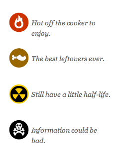
What if our interfaces had a way to show how old the information shown is? In turn also telling how reliable this information is? Surely a tweet that is a year old, is more than likely to be of lesser value and have incorrect information than a tweet from yesterday. The contents of a news article in an online site are a function of time. Why then, do we as interface designers fail to consider these when designing interfaces? Also, this scale of time to distinguish new and old, is relative too. When following news about a football match, the difference between old and new is a factor of hours. While when following the Presidential Election, it is a factor of days if not months. Our representation of time in interfaces needs to be calibrated for this.
An earlier version of the blog of Francisco Inchauste touched on this kind of visual design. I have not seen other examples of something like this being done on the web or apps.
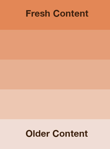
Similarly another simple implmentation could be using color as an index of time. Just like the Clear app uses color variation to represent priority, we might use these color variations for representing time. An older element could literally be faded away snd thereby draw lesser attention from the unaware user. In cases where it does draw the attention or the user ends up coming to it from an outside link, then they are aware of this chronological data without even explicity looking for it in the interface.
What do you think about this? If you have more ideas, examples feel free to send them via Twitter.